Show the State Maps of Blue and Red

During the weeklong Election Day, The New York Times electoral map was permanently open as a tab on my computer. I stared and refreshed.
Eventually, the white-outlined states turned to gray as votes began reporting, and then turned to red or blue, or the ever-exciting red or blue stripe to denote a flipped state.
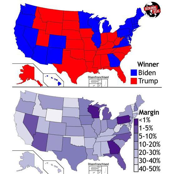
Later in the week, I saw this post from Decolonial Atlas on Instagram, a volunteer-run page and blog that produces maps to alter perceptions about land and people. Although I try to remain skeptical of Instagram infographics, the concept behind this one was too exciting. Instead of mapping the states' majority vote by filling it in red or blue, it showed how close elections were with shades of purple.

"There are no blue states or red states, just a bunch of purple states full of people who don't know their neighbors," the caption read.
This graphic is a more accurate picture of the United States. While not obviously art, the aesthetics of representations of our country that we stare at so frequently can be analyzed as any other art piece. And, as is crucial to note, how we see our country in these electoral maps has immense consequences on our perceptions of our differences.
Ad:

Red and blue are the stereotypical American rah-rah colors, but they were not always associated with the Republican and Democratic parties. Not until the 2000 election did the concept of red states and blue states become universally synonymous with partisan leaning. Before then, the networks would pick which candidate to do in which color, sometimes even in yellow.
During the 2000 election, television networks rather arbitrarily chose red for Republican states and counties and blue for Democratic. Everyone eventually hopped on that bandwagon, and the country stared at those red and blue maps for weeks as the George Bush and Al Gore election dragged on. Twenty years later, we are left with the Republican red and Democratic blue. The parties have embraced their colors, and the electorate sees bright, easily recognizable maps on and before Election Day.
On a visual level, red and blue are both primary colors and near-opposites on the color wheel. The color red had a political history before being bestowed upon the U.S. Republican party as a symbol of the European left wing. The warm color is also historically associated with a spectrum of emotions such as love, anger, passion, war and danger. Blue has political roots in the conservative party of Great Britain. The cool color is often viewed as more "subdued" than warm colors, and, because of the structure of our eyes, appears farther from the viewer.
Still, while the red and blue map looks great on television, it is simply not a reality. We're all a little more purple.
The red and blue graphic posted by Decolonial Atlas and iterations of that graphic have taken up a lot of mental and visual space in our collective consciousness. Although its roots are utilitarian, it has entered the realm of visual culture and is burned into my eyes — perhaps you can relate.
In the formal sense, the red and blue colors are jubilant and pleasingly contrasting. Red and blue are, afterall, opposites on the color wheel. However, this picture is not merely aesthetic. As a map of the United States and as an integral part of our democracy, it is loaded with historical and symbolic significance, which is worth unpacking.
One crucial observation when viewing the red and blue electoral map as a piece of visual culture is that the borders of the states are completely filled with color. This depicts a nonexistent ideological homogeneity within state or county lines. The red versus blue contrast highlights our disparities as a country instead of the commonalities, and it neglects the subtleties of individual opinion. This depiction also does not represent the views of the disenfranchised voters, noncitizens or people under the age of 18. This tidy map, while effective for demonstrating the Electoral College votes, glosses over the fights for suffrage that continue today and the nuanced shortcomings of our system.
Although the electoral map serves the distinct purpose of visualizing the flawed Electoral College voting distribution, it is a dynamic image that represents a dynamic system. The reds and blues and the Republicans and Democrats were not associated until 2000. Maybe — hopefully — in the next twenty years, we will move away from the Electoral College. Who knows what that will mean for the way we vote and how we visually understand election night.
The electoral map does not belong in an art museum by any means. But, regardless of whether it's in a gilded frame or not, the images we consume matter and have visual meaning worth exploring.
Source: https://thehoya.com/off-the-wall-red-blue-purple-the-visuality-of-the-electoral-map/
0 Response to "Show the State Maps of Blue and Red"
Post a Comment